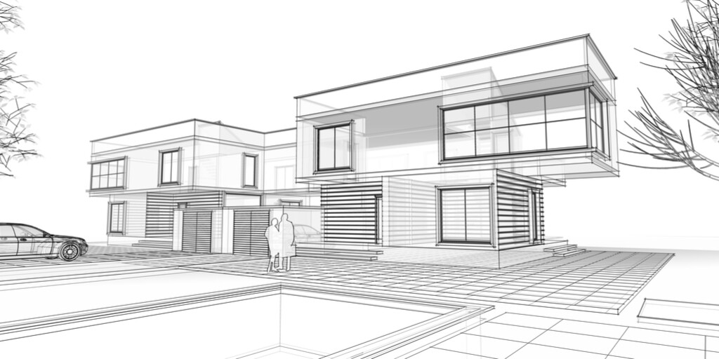
Mid Century Architecture
What Is Mid Century Modern Architecture & Why Does It Persist?
In 1947, a young singer who had just made his first million ($10 million in today’s dollars), walked into the local architect’s office and asked him to build a house in Palm Springs, then a sleepy, sparsely-populated town outside of Los Angeles.
Frank Sinatra wanted a “Georgian mansion” built on the sand between the cacti with mountains in the distance. The singer insisted on all features a Georgian mansion could deliver: four stories, a stone facade, columned entryway, hip roof with dormers, railed porches, and ornate details. Prominent in New England, these homes set the monied families apart from the rest.
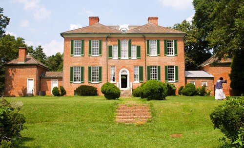
The Palm Springs architect whose office Sinatra had stumbled upon was E. Stewart Williams, a graduate of Cornell University’s renowned architecture school, lecturer at Columbia University, and the son and brother of notable architects.
Williams shuddered at the thought of a stodgy Georgian sitting three or four stories high on the Palm Springs desert with the sand stretching away for miles. Georgians fit well with the looming trees and lush foliage in New England, but on Palm Springs’ flat, pale terrain with only a skinny palm tree or two to offset it, Williams knew Sinatra’s big vision would stand out like a bat on a birthday cake.
Williams had become intrigued by the newest style of architecture: modernism.
Eventually, the architect presented Sinatra with two drawings: the Georgian and a modern style. With both, he included landscape features. Sinatra quickly saw that the single story, sleek, modern home blended beautifully with the sparse, desert environment and went forward to commission Two Palms, which today is one of the most celebrated homes in the mid century modern style.
Mid Century Modern Architecture’s Drastic Break with Tradition
In 1947 when Williams and Sinatra met, the “modern style” was just getting started. Most historians put its reign in the United States from 1945 to the early 1970s, but architects like Louis Sullivan and, his protege Frank Lloyd Wright—as well as some notable European architects—had been experimenting with it since the early 1900s.
Until the turn of the twentieth century, families with the funds (like Sinatra) in both the United States and Europe sought Georgian, Victorian, Edwardian, and Beaux-arts architectural styles. While each has unique elements, these styles showcase ornate design and impressive size, often rising to four stories. They also spring from classical Greco-Roman architecture that emphasizes stone, towering columns and ornate details around windows and porches.
These classic styles may have persisted if not for a handful of community-minded architects who, during the early 1900s, were anxious to try out the new building materials developed during the Industrial Revolution. From the late 1800s to early 1900s, innovations made steel, glass and concrete significantly stronger and less expensive all at once. With better materials, architects could finally begin experimenting with new styles and their own visions.
But it wasn’t just the materials that caused a shift to a whole new style. Brutal World War II, which claimed the lives of 7 million civilians and 10 million troops, drove professionals in many fields to look to the future rather than dwell on the past. The term “modern” reflected the desire to depart from the classical style and any “old ways.” They longed to move forward with an optimistic fresh start that focused on opportunity. After all, history was rife with brutal wars. Could there be another way?
Some architects and builders were even driven by an altruistic desire to provide lovely home design to the middle class affordably. Building beautiful on a budget would require a whole different approach to home-building.
Trailblazing architects included Louis Sullivan in the United States and Walter Gropius in Germany. Louis Sullivan mentored Frank Lloyd Wright, considered by most to be America’s most talented architect to this day.
On both sides of the Atlantic, architects craved simplicity and the prioritization of function over form. They also started pushing that the home should fit into the environment rather than dominate it—just what Williams told Frank Sinatra. In the United States, artists and architects longed to split from the tired Greco-Roman styles and create a uniquely American form. Still, they leveraged ideas from German Walter Gropius’s “Bauhaus” school. (The competing Beaux-Arts School was training artists and architects in standard, classical design.)
By the 1960s, the modern style, eventually coined “Mid Century Modern” by writer Cara Greenberg in her 1984 book, Mid Century Modern: Furniture of the 1950s, caught fire.
Soon, a new architectural aesthetic emerged that surrounded following principles.
Structure Must Integrate with the Environment and Surrounding Buildings
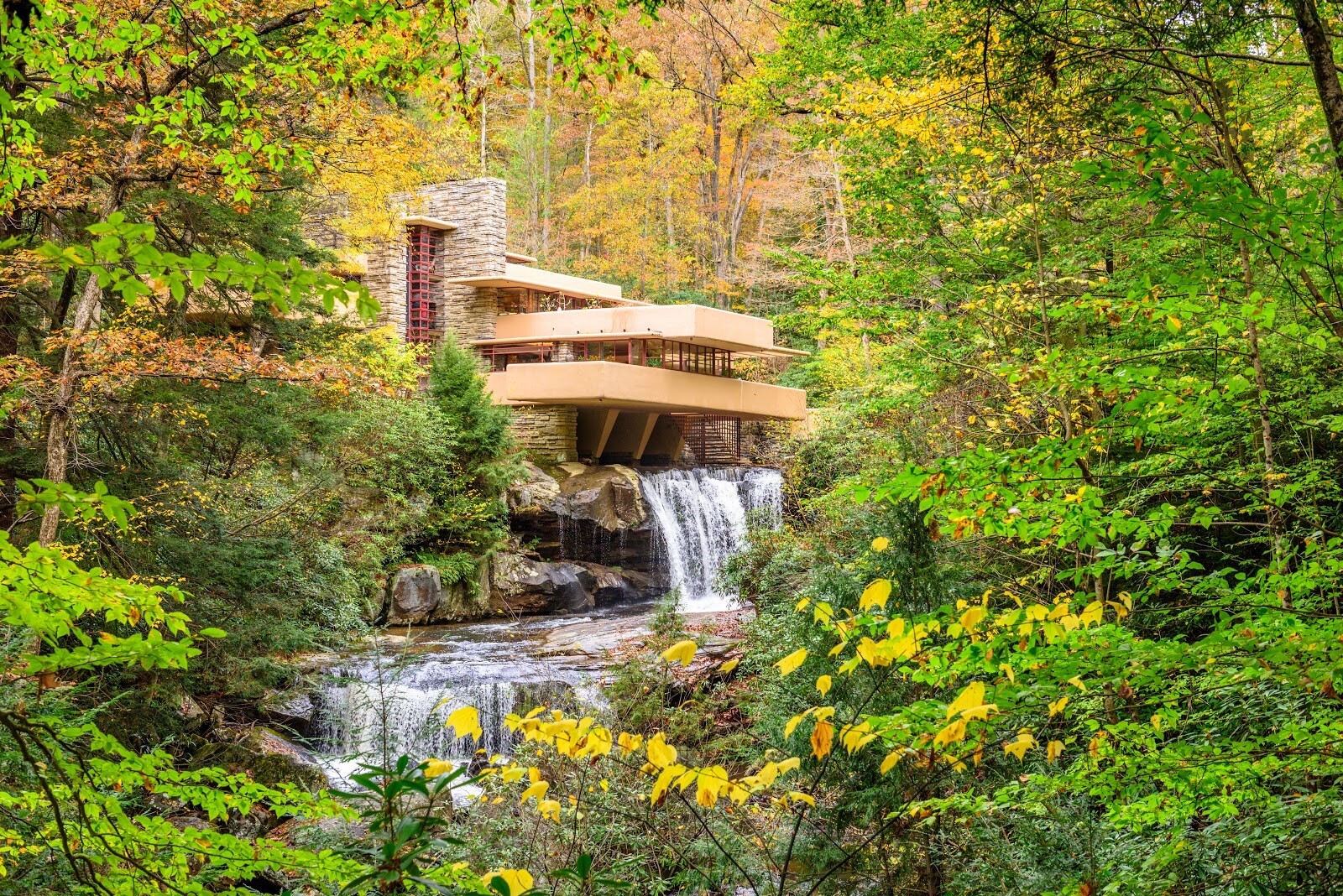
Just as Frank Sinatra’s Twin Palms home worked best in a low slung, meandering form in the flat desert, Fallingwater—Frank Lloyd Wright’s most renowned work—used graduated levels to mimic the waterfall on which it was built. Wright also repeated the dark browns of nearby trees in its beams and the pale of the surrounding sandstone in the exterior walls and towering fireplace.

Newly affordable glass helped architects create exciting, affordable office buildings.
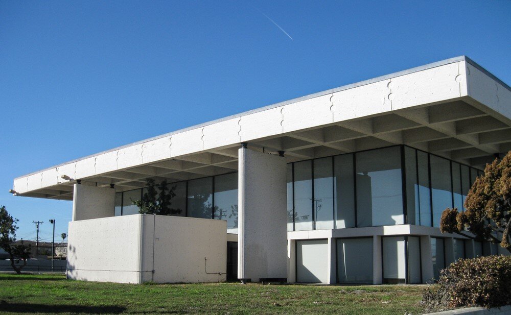
Commercial buildings built in the modern style, too, should coordinate with the landscape, even if it’s a streetscape. These office buildings coordinate with each other via use of glass but retain their distinction via shape.
The Building’s Materials Should be Featured, Not Hidden
Modern architects, enamored of the new stronger glass, steel and concrete, felt these materials should be showcased rather than enclosed behind stone or wood—the manner of the classical architects.
Concrete, steel and glass created clean lines and even voluptuous curves. The modernists believed that if a steel beam was integral to the home’s structure, its prominence should not be diminished. An onlooker should be able to comprehend the home’s structure at first glance. The angled roof lines and exposed concrete in many Mid Century Modern homes reflect this respect for the new materials in their raw forms.
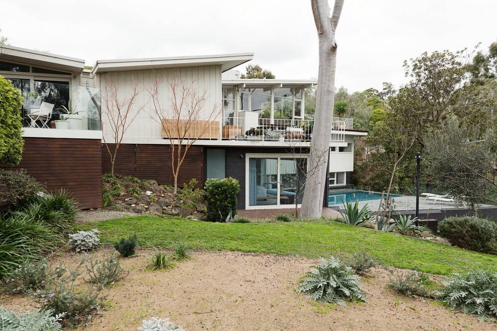
The Building’s Function is More Important than Its Form

In importance to form. In this office, professionals more easily focus on complex inner lives and ideas rather than complexity in their surroundings.
Rather than building big and ornate to impress, the modern architects adopted a practical, economical and functional approach that incorporated honest, rather than garish, use of materials. If work is getting done on the inside of the building, employees should function without distraction. Surrounded by clean lines and organization, they could think and collaborate more efficiently.
Similarly, function over form should dominate in residential sphere. In the post-World War II era, families began to the home as a refuge, rather than a showplace. If the home is meant to be comfortable rather than intimidating, color, texture and shape should be welcoming and simple. Furniture should provoke relaxation. No dining room chairs with scrolled handles or couches made of florid fabrics with straight backs and carved wooden feet.
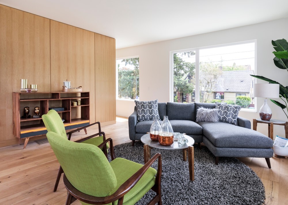
A fluid barrier between interior and exterior spaces help homeowners feel part of a greater purpose.
Use Textures and Colors from the Environment in the Interior
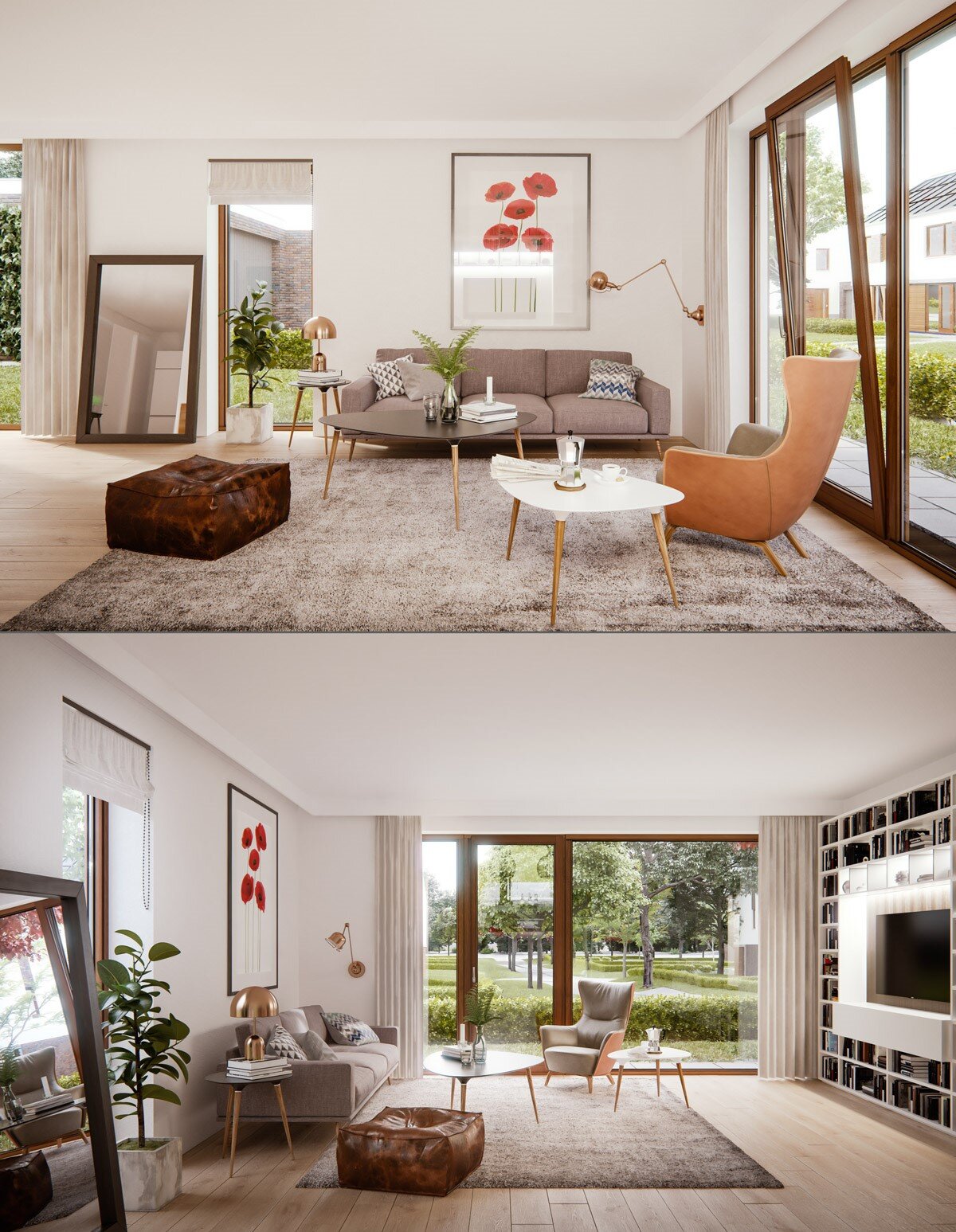
Neutral tones and browns in this living room mimic the tree trunks outside. The green plant in the room repeats the leaf and grass color. Floor to ceiling windows lend a sense of open space.
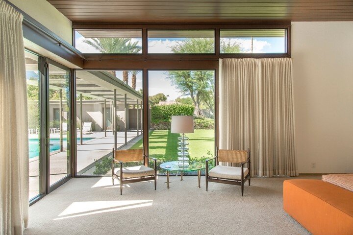
In this example from Frank Sinatra’s Twin Palms estate, notice how the vertical lamp sends the eye to the lawn and walkway beyond.
Simple, Even Curved Lines

Contrasting with the bric-a-brac and complexity common in the classically-inspired Victorian, Edwardian and Baroque styles, Mid Century Modern architecture employs clean, even curved lines. Again, the building’s artistic appeal depends more on its entire structure rather that any busy decor.
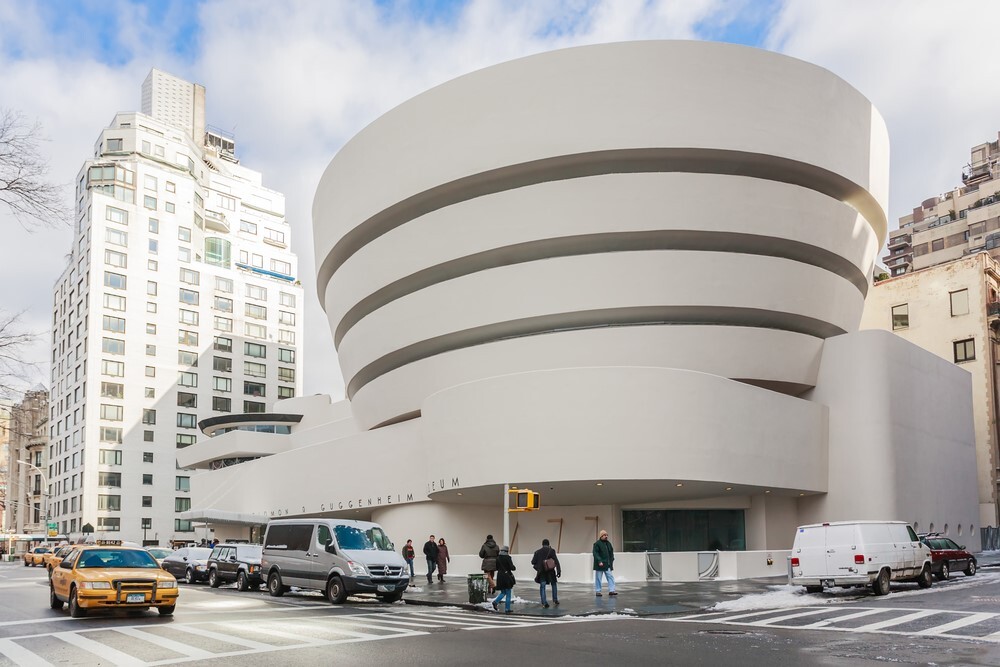
By the time New York’s Guggenheim Museum was in the works, Frank Lloyd Wright had the power and reputation to take modernism to its limit, making a building of entirely curved line.
When critics raised their voices in protest, saying the building detracted from the art inside, Wright wrote, “On the contrary. The design makes the building and the paintings an uninterrupted, beautiful symphony such as never existed in the World of Art before.” This quote reveals just how dedicated Wright was to the modern architecture principle of prioritizing function over form and ensuring exterior style matched interior style.
Mid Century Modern Architecture Today
Frank Sinatra was one of the first to choose a modern style for his dream home. When the style was replicated in commercial buildings, soon more homeowners caught the energy of a futuristic, optimistic, comfortable, affordable and environmentally coordinated aesthetic.
While its influence began to fade in the early 1970s, the popular show Mad Men helped bring tulip chairs, single-story split-levels and wall-sized picture windows back into vogue.
Today, conferences, shows, tours, museums, preservation societies and more exist so that Mid Century Modern enthusiasts can expand their knowledge and appreciation of a style with the audacity to break from centuries of tradition. You can find everything you need to become a true connoisseur of Mid Century Modern architecture, art, influences, events and more on this site and on our sister site www.mid-century.com
Please send any questions or comments to: Contact Us

